For you Wordpress 2.0 using musicians out there, here's a plugin I wrote today: CC Mixlist. It grabs the latest remixes of an artist off CC Mixter so you can display them on your website. I'm using it now in my remix section to list all the Brad Sucks remixes over there. Maybe somebody will find it useful.
Ziggy Stardust comic - scans of a David Bowie/Ziggy Stardust comic. They should revive the Rock Fantasy line of comics and do indie bands. Everyone can be working day jobs and have no time to fight crime.
I ordered a laptop yesterday. An Inspiron 6000 because it was $450 off the regular price. Now I'm wondering what kind of sound card to get for it. I'm planning to use it for recording and for playing live if I can get over my paranoia of spilling beer on it or it getting stolen or some sound guy stepping on it. If anyone knows anything about that stuff, please let me know.
Professional Writing and the Rise of the Amateur - John August has a transcript of a great speech about professionals vs. amateurs on the net.
As a follow-up to the logo contest results I've got t-shirts for sale with the winning logo on it in my new Spreadshirt store:
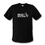
So I did this contest on Worth1000.com for a Brad Sucks logo. The final count was 79 entries, which I think was a great turnout. The user rating is in and you can see that here. But I ultimately get to decide who gets the $100 prize. So first off, here's the winner:

I thought about it for a long while but I wound up going back to this one. I like it because it's simple, clean, evocative and weird. What does it say? Something about falling / hurting yourself / being inept / breaking your neck / warning. Pretty general but I think it's spiritually connected to whatever themes my music might have. People I've shown it to have alternately found it funny or curious, but just about everyone has been intrigued by it, which is what I want.
Also for bonus points: the falling guy was taken from one of my Hawaii photos of a warning sign which also said: "if in doubt, don't go out". I loved that when I saw it. "Welcome to paradise - BEWARE THE MANY DANGERS." Great funny/sad stuff. That probably helps me feel a personal connection to it and less like it's some phony contrived logo.
SECOND AND THIRD PLACE
I also bought two of the other logos for a lower price and they are:

Brad Sucks with the fancy BS logo - I really like the BS logo part of this. The logo style combined with the words "brad sucks" I think is kind of funny but also quirky and interesting. It's probably not one I would use to always represent Brad Sucks because it might be a little too funny, but it has a simple weirdness and irony to it that I liked enough to want to keep.

brad sucks logo design - This is the one a lot of people I know picked as their favorite. It was a little plain to me at first but I warmed up to it as it's nice looking, simple and would be easy to use on things without taking up too much space.
Read on for some more jibba jabba about logo selection:
WHAT I'D DO DIFFERENT
Before I get to giving props to some of the other logos, I should explain some things I didn't know I was biased against. Maybe this'll be helpful info if other musicians out there are thinking about getting logos. If I had to do the contest over again, I'd specify:
- No guitars. While I can and do play guitar, putting a guitar in the logo to me says "BRAD SUCKS IS ALL ABOUT GUITARS" which it's really not. I'd feel like I'm trying to be Van Halen or Steve Vai or something. And even they don't put guitars in their logos (1, 2). Also as a small nitpick: I play left-handed and all the guitars in the logos are right-handed.
- No "suck" puns. Lollipops and lemons and so on are cute but I picture people just thinking I really dig on candy or have an oral fixation. "Hey, I'm Brad and I like to put things in my mouth, what's up."
- No smiley faces. Despite having a smiley-face logo currently in my arsenal, I don't need another one. Nirvana rocked the smiley face and that's hard to compete with.
OTHER NOTABLE ENTRIES
Brad Sucks Copyright Logo - This is a really excellently done logo and it does a great job communicating several things at once. My problem with it is the message it sends. It clearly says "Brad Sucks is a one man band who plays guitar (maybe really awesomely since it's in his logo) and doesn't care for copyright" which, while true (except for the awesome guitar part), is kind of a vanilla message and doesn't communicate much about the actual themes or character of my music. It would probably get me more nerd cred though.
Brain Fix - At first I didn't know what this one was supposed to be and then I read the description and I was all "awesome!" and grew to love the little brain icon. The only problem was that most people I showed it to didn't recognize it as a brain (often even after I told them what it was) so I had to count it out. I wanted to love this one though.
Napster Logo - This one's pretty cool and well done, but it looks a lot like the Napster logo. Despite it being ironic, I'd feel like I was advertising for Napster -- which would be extra awkward as I turned down advertising for Napster on here recently. And it's got a bit of a suck pun in there with the tongue out and all. Maybe more of a lick, but still in the mouth area.
There were lots of other great entries as well, but those were the three that stood out the most. CONCLUSION
I'm definitely glad I ran this contest. It was fun to do and as an unintended side-benefit it got a whole bunch more people into my music. I feel like I got my money's worth out of it and I'd recommend it to other musicians on a tight budget. I think you'd have better success if you gave examples of the sorts of band logos you like, rather than leaving it wide-open like I did. I don't think I was as clear as I could have been in my contest description. So that's something I'd pay extra attention to.
I'm way, way, hopelessly, way behind on posting remixes. I've been in denial about it as they've stacked up, but I think I have to admit that I'm so far behind I may never be caught up again. I still love getting the remixes -- but it takes a lot of time to process them and I'm short on the time lately. CC Mixter and I'll make listing those here a priority. Sorry to all the remixers who sent stuff in that hasn't been posted. Anyway, I just thought I'd come clean.
Update: Remix posts to CC Mixter should automatically show up in the remix section (way down at the bottom) now. Still tidying that up, but it seems to work.
The gig on Saturday night went all right, the roads were snowy as hell and not too many people were there, but it was a nice second full-length show despite all our colds. Thanks to the folks that did come out and said kind things. I broke my A string on the second last song ("We're Not Friends") and decided not to play guitar for the finale (a cover of "Search and Destroy" by The Stooges) instead of re-stringing for one song. Then while I sang without playing my hands got bored and I pulled on the broken A string and I guess cut my finger open and I saw a pretty decent amount of blood coming out of my hand.
Anyway, it was probably the most rock and roll thing in the history of me and it all ended when I was given a band-aid after the show. I'm sure Iggy Pop would have done the same.
Brad Sucks is opening for Just this Saturday night at Greenfields Pub. I think we go on at 9pm. We've practiced a lot but we may all have colds. Rocking will be attempted nonetheless.
Synthesizer Medley 1985 - Video of Thomas Dolby, Herbie Hancock, Howard Jones, and Stevie Wonder in a Synthesizer Medley at the 1985 Grammys. What the- [via]
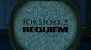 Zach wrote in to tell me that he heard a version of my song Dirtbag in a Fark.com trailer mashup contest. The entry is by Mike Hindes and called Toy Story 2 Requiem. It's a hilarious mash-up trailer of the movies Toy Story 2 and Requiem for a Dream.
(15mb WMV) (Warning: there's some R-rated language.) Very awesome. It almost makes me glad I sat through 90% of Requiem for a Dream so I could find this extra funny. Almost. I'll never forgive that movie.
I also like how absurd the level of mashup-ness is getting on my music. "Hey, an Israeli remix of your song was used in a movie trailer mashup!" Say what now?
TheHipCola and I did an ABBA cover. Grab it here. (6mb mp3) This is for the ABBA Sidefight going on over at Songfight where everyone was called upon to cover ABBA songs. I've been real into ABBA lately so I wanted to do something for it. I think ours turned out well. Hard to live up to the awesome original though.
I'm trying to put my Brad Sucks gallery back together. I lost a lot of that stuff in some sort of server disaster long ago. If you've done any Brad Sucks artwork or videos, feel free to send them in. Also I'm trying to remember the credits for some of the things in there.
Oh yeah, the logo entries are now online and you'll get to see what the community rated them in a couple hours. There were 82 entries all in all, though that has dropped down to 79 now for some reason. I think I have a week to decide on a winner, so I'll do a little write-up re: my thoughts and feelings when I do.
There are 24 hours left in the Worth1000 Brad Sucks logo contest. 52 entries so far and I'm looking very much forward to seeing them.
I'll be on the "Blog-Rolling" panel at Canadian Music Week in Toronto on Saturday, March 4th. So if you happen to be there, feel free to throw something at me. I've never been to one of these fancy music conferences so it'll be interesting. I have so much great, great advice for other independent musicians I don't know if an hour will be long enough. I also hope I can go the entire hour without saying the phrase "whore yourself out". We'll see how I do!
 I went to see Body Worlds 2 in Toronto yesterday. You can read about it on Wikipedia here, see lots of images of it on Google Images here. (We weren't allowed to take pictures.)
It was a little crowded but otherwise corpse-tastic. Before I went in I was concerned I might puke, I'm not big on dead things. But once I got in there that fear faded and I was more afraid someone else would puke and that would create a puke chain reaction that would take me down with it. After a while that wore off and nothing much happened. Bodies are gross though.
Gizmodo had a contest to make songs out of the sounds of hard drives failing. Very neat. Check out the write-up here. The winner is awesome.
Screenwriter John August was nominated for a Grammy for writing "Wonka's Welcome Song" from Charlie and the Chocolate Factory. He has an amusing first-hand account of attending the Grammys.
I've put up a $100 jackpot in this Worth1000 contest for a Brad Sucks logo. I've been trying to put together a semi-decent press kit forever now. I hate doing that stuff, it's awful and I'm terrible at it.
I thought a cool logo might help, but art is hard to come by. I talked to a few people about it but after pricing it out I decided I'd give the Worth1000 community a shot. They're enormously creative over there (check out their previous corporate contests) and I'm looking forward to seeing what they come up with.